I posted some Impressabilities Tips/Techniques with the Cuttlebug a week ago HERE. This post will build on those techniques, so if you have not read them, you may want to check that post out first and then come back.
I was interested in what else I could do with Impressabilites and came up with the following ideas. (I thought the writing on the photos would be alot bigger...sorry.)
I was interested in how the Impressabilities would translate to vellum, so I tried some different ideas, and posted my results for you.
Sample 1
I spritzed the vellum with water and then embossed it with the Impressabilities. I spritzed it to see if the embossing would come out more defined like on CS. I found that it didn't make as much of a difference as it does on CS, and that the vellum dried more wrinkly (is that a word...lol?).
Sample 2
I used a smaller piece of vellum, and did NOT spritz it first.
Sample 3
This piece of vellum did not photograph well, but I wanted to see what chalking the embossing would look like. This piece was NOT spritzed with water.
Samples 4 & 5
For these samples I used the Letterpress Technique with Fiskars Silver Pigment Ink. The first photo shows how well it covers the vellum, while the second photo I tilted so that you could see the shine of the ink.
Sample 6
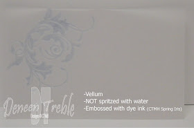
On this piece of vellum, I embossed the corner with just a piece of the Impressabilities which I inked up with Dye Ink (CTMH Spring Iris Ink)-the Letterpress Technique. The dye ink gives it a soft look.
Sample 7
This is the same vellum piece as Sample 6, but with a piece of blue CS behind it to show you how colour can change the look of things.
Sample 8
This piece of vellum is embossed with no ink.
If you don't own any Pigment Inks (for the Letterpress Technique), you can get a fairly close similar look (is that proper grammar???) with Dye Ink and a Brayer. Spritz the CS before embossing with the Impressabilities, then before removing the Impressabilities, brayer over the embossed side (the opposite side of the CS from the Impressabilities). Not quite as crisp a look as the Letterpress Technique, but not too bad. (The ink used-CTMH Sweet Leaf)
I used the same technique as Sample 11, but inked the CS with a lighter colour, CTMH Buttercup Ink.
I wanted to see how the Letterpress Technique looked with a dark Dye Ink, like CTMH Moonstruck, on a colour CS like CTMH Spring Iris. I applied the ink to the Impressabilities directly using the ink pad. Pigment Ink is the best way to go, but the darker dye ink didn't turn out too bad. One thing I noticed was that the ink sort of 'beaded' up on the Impressabilities, which led me to try applying the ink with a brayer...see Sample 14.
I used the same technique as explained in Sample 13 using CTMH Buttercup Dye Ink, with CTMH White Daisy CS. Rather than applying the ink directly with the ink pad, I used my brayer to ink up the Impressabilities. I found that the ink had a smoother finish, and did not bead up like in Sample 13.
For this sample of Letterpress Technique I used CTMH Black CS and CTMH White Daisy Ink.
I wanted to see what tone-on-tone would look like. Here I used Maya Road Dark Brown Pigment Ink, and CTMH Chocolate CS.


Fabulous post! Sort of an embossing test kitchen! You've done all the work for us! Thank you for sharing your experiments.
ReplyDeleteThank you, thank you, thank you! I've looked at these but wasn't sure. Now I know.
ReplyDeleteTer ;)
I was just looking for the correct Cuttlebug sandwich for Impressabilities and found all this information! Thanks.
ReplyDelete